"Living is like tearing through a museum. Not until later do you really start absorbing what you saw, thinking about it, looking it up in a book, and remembering--because you can't take it in all at once."-- Audrey Hepburn
There are a lot of things a book artist must consider when laying out and designing a book--the typeface, the spacing, the size of the type, the alignment, the thickness and color of the paper, and more. And because text from books is the medium from which I am creating these paintings, all of these elements impact the final product.
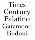
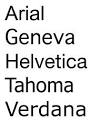
For example, I know that fonts which have serifs are easier to read because each letter has a tiny stroke that leads the eye from one letter to the next. Because it facilitates ease of reading, the body type of most books is a serif type, whereas sans serif fonts are very clean and are often used for titles and dividers since they effectively slow the eye and keep it from moving on to the next word. The difference can be seen below. (Perhaps I should consider the default choice of a sans serif font for the body type of this blog...)
There are a lot of things a book artist must consider when laying out and designing a book--the typeface, the spacing, the size of the type, the alignment, the thickness and color of the paper, and more. And because text from books is the medium from which I am creating these paintings, all of these elements impact the final product.
For example, I know that fonts which have serifs are easier to read because each letter has a tiny stroke that leads the eye from one letter to the next. Because it facilitates ease of reading, the body type of most books is a serif type, whereas sans serif fonts are very clean and are often used for titles and dividers since they effectively slow the eye and keep it from moving on to the next word. The difference can be seen below. (Perhaps I should consider the default choice of a sans serif font for the body type of this blog...)
| 
|
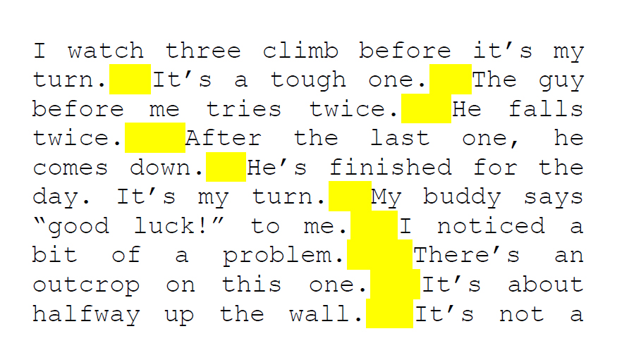
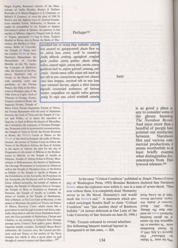
Something else readers may not be aware of is the impact of text alignment on the visual experience. Text that is aligned to the left with a ragged right margin is much easier to read and results in less reader fatigue than reading text that is justified, or aligned on both left and right margins. The reason is because in left aligned text, the spaces between the words are almost all the same, thus they are predictable and the brain knows what to expect. In justified text, however, spaces vary and can often result in "rivers" of white space forming on the page (see highlighted example below), something that is subliminally distracting to the eye. This spacing discrepancy can be so irritating, I have known professors who refused to accept justified papers.
| In much the same way textual idiosyncrasies impact the reading experience, I have discovered that they also impact the experience of viewing my text-based art. For example, the text from Breakfast at Tiffany's is much larger with more space between the words, letters, and lines than the text from Joyce's Ulysses, and the paper of the first is lighter and thicker than the second. |
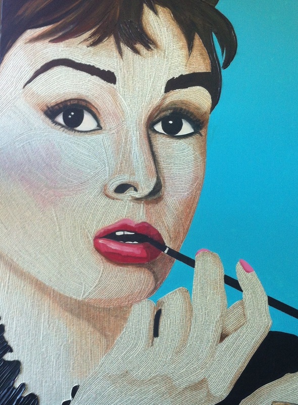
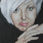
While it may seem trivial, I consider these factors when planning my text projects. I knew that the text and paper for Audrey's Hepburn's portrait must be relatively light because the image I chose to create had very few shadows and not a lot of pigment. On the other hand, the tighter text and darker paper of the Joyce novel that will be turned into Marilyn Monroe's face will result in the overall painting being much darker. This is not a problem, however, because the image I am working from is darker and more dramatic.
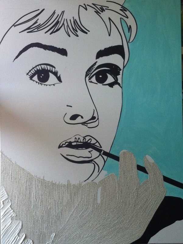
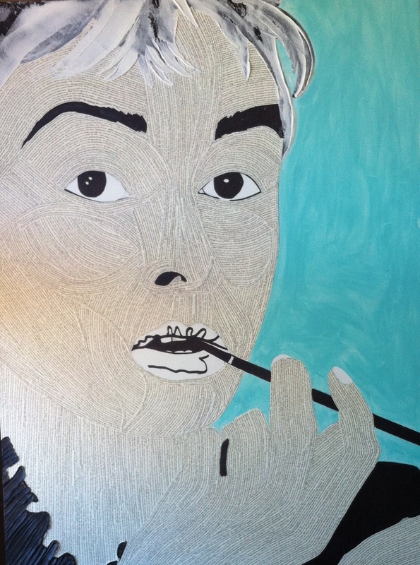
As I work on each of these text generated images, a pattern has revealed itself to me. First I make a fairly simple black line drawing which basically locates features and shadows on the canvas. This is usually an easily recognizable, if not very well developed, study. The next step, covering the entire face with text, results pretty much in the destruction of the image. The third step, applying color with an acrylic wash, brings the image back into focus so to speak, and the fourth step is to fine-tune the details and correct minor mistakes. For example, in the third photo below, I immediately note that the space between Hepburn's eyes is too wide and too triangular in shape. Other alterations will include placing and adjusting shadows, w few white highlights. The outcome remains to be seen.
As I work on each of these text generated images, a pattern has revealed itself to me. First I make a fairly simple black line drawing which basically locates features and shadows on the canvas. This is usually an easily recognizable, if not very well developed, study. The next step, covering the entire face with text, results pretty much in the destruction of the image. The third step, applying color with an acrylic wash, brings the image back into focus so to speak, and the fourth step is to fine-tune the details and correct minor mistakes. For example, in the third photo below, I immediately note that the space between Hepburn's eyes is too wide and too triangular in shape. Other alterations will include placing and adjusting shadows, w few white highlights. The outcome remains to be seen.
| 
| 
| 
|
It is perhaps a stretch to say that these canvases are a form of ergodic literature, because the text is not read in an entirely linear fashion. In ergodic literature, "nontrivial" effort is required to allow the reader to traverse the text, meaning that the reader must do more than make a "trivial" effort, which usually consists of visually following the lines of text from one margin to the other, and where appropriate, physically turning the pages. Consider, for example, a common subcategory of ergodic literature--cybertext, wherein the reader follows links from one piece of text to various others. Another example of ergodic literature is the popular "Choose Your Own Adventure" books that allow juvenile readers to make choices that impact the resolution of the plot.
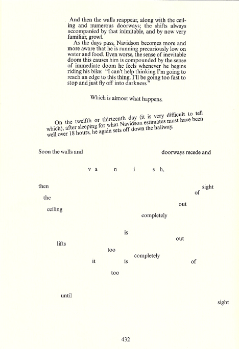
A well known contemporary example of ergodic literature is House of Leaves by Mark Z. Danielewsky. Its format, structure, page layout and style are all unconventional. The book contains many different fonts, a variety of colors, words placed vertically and horizontally and at other angles, footnotes, footnotes within footnotes, and many other unusual stylistic devices. (See examples below.)
A well known contemporary example of ergodic literature is House of Leaves by Mark Z. Danielewsky. Its format, structure, page layout and style are all unconventional. The book contains many different fonts, a variety of colors, words placed vertically and horizontally and at other angles, footnotes, footnotes within footnotes, and many other unusual stylistic devices. (See examples below.)
| 
| 
|
As you can imagine, it is not always easy when confronted with these unusual pages, to decide what to read first or how to react to it. The reader is forced to make decisions. This is why I think my text paintings have a certain ergodic element to them.
I am always interested to see how viewers react when first exposed to my text paintings. Most people are familiar enough with the various titles to be able to pick out words, phrases and names that identify the source. Some viewers are irritated, however, because they can't simply start reading at the top left and make their way across and down the canvas. They don't like the fact that the text strips end mid sentence, or that they don't always connect in ways that make traditional sense. Either way, viewers generally spend time interacting with the work. What more could I ask?
I will close today with a delightfully appropriate quote from Mark Twain--
"Ideally a book would have no order to it, and the reader would have to discover his own."
 RSS Feed
